
Service Topology
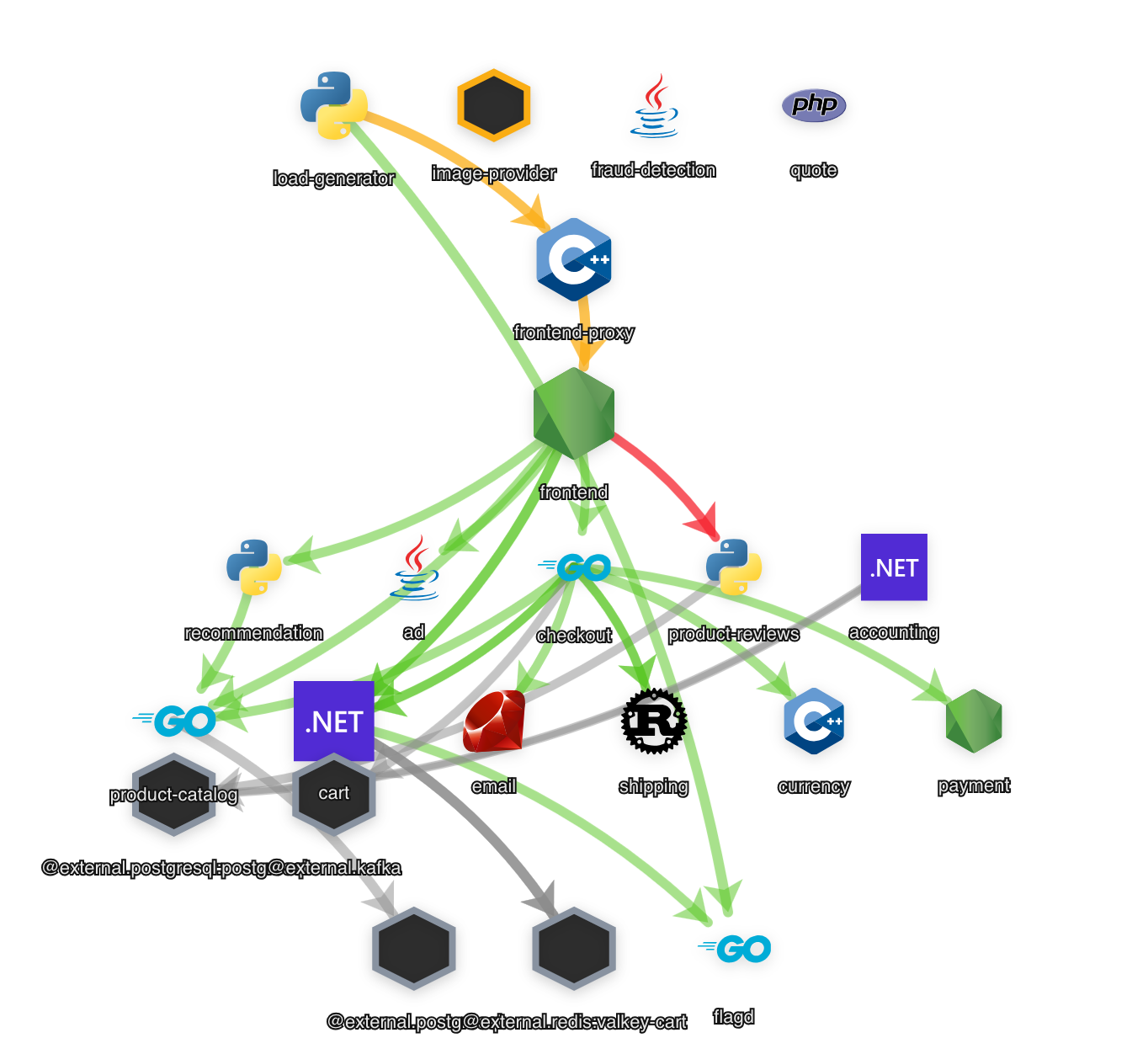
Service Topology is the map of your system. Every service that reports telemetry is a node, every call between services is an edge, and the rate, error rate and latency of each are read straight off the graph — so the slow and failing parts of the system are visible before you open a single trace.
It lives under Exploration → Service Topology. It is the full-system view; the ranked, path-focused analysis of the same graph lives under Intelligence → Critical Paths. The same graph also sizes an incident’s blast radius: when a service degrades, Incidents walks its downstream dependents to score the impact — what depends on it, and what feels it.
Reading the map
Section titled “Reading the map”Nodes are services
Section titled “Nodes are services”Each node is one service. Its icon is the service’s language or SDK, and its label is the service name (prefixed with its namespace when there is one).
- Size is traffic. A busier service — more requests per second — draws a larger node.
- Colour is health. A ring around each node is green (Healthy), amber (Warning) or red (Critical), taking the worst of the service’s rate, error and latency signals. A grey node is one atrim.ai has no metrics for yet — either an uninstrumented peer, or a service seen only as the far end of a call. A legend under the graph names the colours.
Hover a node for its numbers: Rate (req/s), Errors (%), P95 Latency (ms) and Spans, each flagged healthy / warning / critical, with a short note on what to look at when it is not healthy.
Edges are calls
Section titled “Edges are calls”An edge is a call dependency, drawn from caller to callee — the arrowhead points the way the call flows. A thicker edge carries more calls. Hover an edge for the total call count and a breakdown of the top operations behind it.
The header strip
Section titled “The header strip”Above the graph, three gauges summarise the fleet — Performance (latency health),
Reliability (error-rate health) and Telemetry (how much of your system is reporting) —
alongside a plain healthy / total count and how many services need attention.
Working the graph
Section titled “Working the graph”- Click a service to open its drawer on the right. The rest of the map dims so the service and its neighbours stand out. The drawer has three tabs: Trace Diff (compare this service’s behaviour against a baseline), Metrics (its rate / error / P95 tiles, a latency band over time, and the issues detected on it) and Logs (its recent lines). The Metrics and Logs tabs each open the same scope in Metric Explorer or Logs in one click.
- Filter the Services list on the left to jump to a service by name or namespace.
- Refresh (the button on the graph) recomputes the map from your current traces — use it after you have changed something and want to see the effect now.
- Analyze (in the global header) recomputes the map’s statistics on demand.
- Time range and auto-refresh come from the global header controls: pick the window, and choose whether the map re-polls every minute, every five minutes, or only when you ask.
- Zoom, fit and drag live on the graph itself; node positions you drag are remembered.
External peers
Section titled “External peers”Databases, caches, queues and third-party APIs that your services call but that do not report telemetry of their own are inferred from outbound calls and drawn as external nodes. They are shown by default. To hide them and see only services that report telemetry, turn off Settings → Appearance → Service Topology → Show external dependencies.
While your map is building
Section titled “While your map is building”On a brand-new workspace the aggregated tables that back the map are still warming for the first few minutes after data starts arriving. During that window atrim.ai serves the map directly from your raw traces and shows a calm notice:
Building your service map… — Analyzing your telemetry; services and their connections fill in as data is aggregated. This updates automatically.
You do not need to do anything. Services appear as their first requests land, edges fill in as the dependency tables populate, and the notice clears itself once the aggregated map is ready — the view polls every few seconds while it warms.
If the map ever looks sparse, adjusting the time range usually settles it while the aggregated tables catch up.